Realistic Portrait

Picture this: the afternoon sun streams through your window as you transform a blank page into a captivating portrait.
With each pencil stroke, a face comes to life—intense eyes, softly parted lips, and textured skin that radiates depth.
This is the magic of portrait drawing. Whether you’re just starting or honing your craft, mastering realistic portraits is a journey.
Ready to elevate your skills? Let’s explore the tools and techniques that will take your art from good to extraordinary!
Key Takeaway
- Tools Matter: Invest in high-quality pencils, erasers, and paper. And experiment with different mediums like red conte crayon to discover which works best for you.
- Proportions Are the Foundation: Spend time getting the proportions right from the start, using tools like grids or proportional dividers.
- Build Gradually: Don’t rush the shading process—build up light and dark values slowly to maintain control.
- Focus on Lighting: Understanding how light interacts with the face is essential to creating a realistic portrait.
- Details Are Key: The texture of skin, hair, and facial features requires different techniques. Practice conveying these with varied pencil strokes and shading methods.
Table of Contents
The Essential Tools for Realistic Portrait Drawing

A great artist is only as good as their tools—okay, maybe not entirely, but it sure helps!
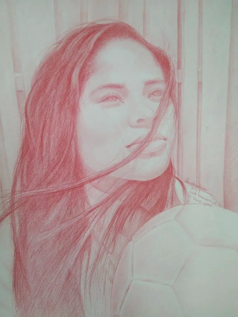
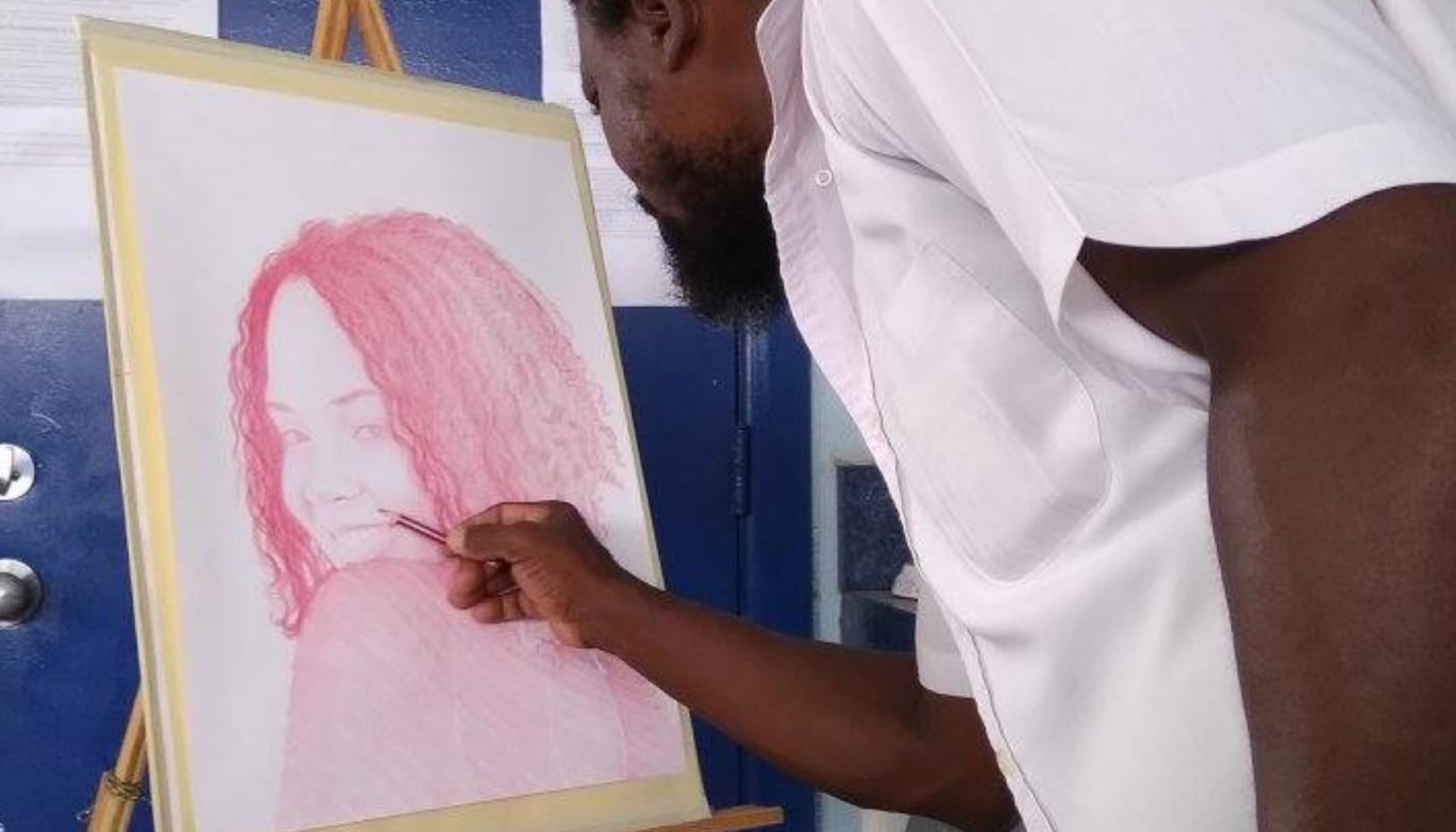
Over the years, I’ve experimented with several mediums including graphite, charcoal, pen, and pastels, but right now, my heart belongs to red conte crayon.
There’s something about it—the texture, the richness of the color, and the way it interacts with the paper—that makes it an ideal medium for creating lifelike portraits.
Here are some essential tools you’ll want to have in your arsenal for mastering portrait drawing:
Graphite Pencils (H, HB, 2B, 4B, 6B, 8B)

- Graphite pencils are the bread and butter for any portrait artist. With a wide range of hardness (H being the lightest and B the darkest), you can control the depth, contrast, and texture in your drawings.
- Finer pencils (H to 2B) are ideal for soft skin textures and hair, while darker pencils (4B to 8B) create bold shadows and deep contrast.
Charcoal Pencils

- If you want dramatic, high-contrast effects, charcoal pencils are your go-to. They’re ideal for creating darker, intense shadows and backgrounds.
- Just keep in mind that charcoal is more difficult to control than graphite, so it requires a lighter touch.
Red Conte Crayon

- My current favorite! Red conte crayon has an earthy, warm hue that adds a classical feel to portraits. It’s incredibly versatile—you can go soft with light layers or bold with more pressure.
- The texture it leaves on paper is perfect for showing skin tones and organic, subtle gradients. It’s particularly effective when drawing midtones and highlights, as it offers a velvety finish.
Blending Stumps and Tortillons

- These tools are magic wands for blending shadows and softening lines.
- For areas like cheekbones or the curve of a lip, blending stumps allow for smooth transitions between light and dark, making skin look more realistic.
Kneaded Erasers and Vinyl Erasers

- A good eraser isn’t just for fixing mistakes—it’s a tool for adding highlights.
- Kneaded erasers are soft and moldable, so you can create small, controlled highlights, like in the eyes or on the tip of the nose.
- Vinyl erasers are perfect for larger areas that need to be completely erased or brightened.
Drawing Paper

- Your choice of paper can affect the outcome of your drawing. I prefer using toned paper—especially with red conte crayon—as it provides a midtone base.
- This allows you to work in both directions, darkening and lightening the portrait, to create a more dynamic range.
Ruler and Proportional Divider

- Precision is key in portraiture. A ruler helps with scaling proportions correctly, and a proportional divider allows you to measure and translate distances on a photo reference accurately to your drawing.
Techniques to Take Your Portraits from Good to Phenomenal

It’s not enough to just have the tools—you need the right techniques to really bring your subject to life. Here’s how to get there:
1. Master Proportions Early On
- Proportions are everything when it comes to realistic portraits. A small mistake in the positioning of an eye or the length of a nose can completely throw off the likeness.
- Start with light guidelines to map out key facial features.
- Divide the face into thirds (forehead to eyebrows, eyebrows to nose, nose to chin) to ensure everything lines up correctly. This will act as your scaffolding.
2. Focus on the Eyes
- Eyes are the windows to the soul, as they say, and they will make or break a portrait.
- When drawing eyes, pay attention to the subtle shading around the iris and eyelids, as well as the catchlight—those small reflections of light that make the eyes sparkle.
- If you can get the eyes to look alive, the entire portrait will feel more authentic.
3. Build Up Gradually
- One common mistake artists make is going too dark too fast. Build up your shading slowly, especially with graphite or conte crayon.
- Start with lighter layers and gradually darken areas. This gives you more control and prevents mistakes.
4. Use the Grid Method
- If you’re struggling with getting proportions right, try using the grid method.
- This involves drawing a grid over your reference image and then lightly drawing the same grid on your paper.
- By focusing on one square at a time, you can more easily replicate the shapes and proportions from your reference.
5. Capture Light and Shadow
- Realism in portraits largely comes from understanding light and shadow.
- Study your reference closely—where is the light source? How does it hit the face?
- Look for shadows in unexpected places (under the nose, beneath the eyebrows) and replicate these using soft gradients with your pencil or crayon.
- Highlights, like those on the cheekbones or the bridge of the nose, should be gently blended into the surrounding tones for a seamless effect.
6. Experiment with Textures
- Realistic portraits aren’t just about shading; they’re also about texture.
- Use different strokes to convey various textures—light, wispy strokes for hair, soft circular motions for skin, or rough, grainy strokes for eyebrows and facial hair.
- The variety of textures will make your portrait feel more tangible and lifelike.
7. Draw in Layers
- Whether you’re using graphite, charcoal, or conte crayon, drawing in layers adds depth to your portrait.
- Start with a base layer that establishes the midtones. Then, add layers for shadows and highlights.
- Layering also allows you to correct mistakes more easily—you can always go back and adjust shadows or rework highlights as needed.
Concluding Thoughts on Realistic Portrait

Mastering realistic portrait drawing is a marathon, not a sprint.
Each portrait you draw will teach you something new—whether it’s how to better capture the light in someone’s eyes or how to subtly shade skin tones with a red conte crayon.
As with any craft, improvement comes from practice, patience, and pushing your boundaries.
So, grab your pencils, your charcoal, or your conte crayons and start drawing.
Every stroke is a step closer to mastering the art of portraiture. And remember—your best portrait is yet to come!

Leave a Reply